I have been involved in several catalogs over the course of my career.
While working for Positive Action, Inc. in the early 2000's I completed their first real product catalog in years, from scratch, doing a lot of new product photography myself, working with the owner and a staff writer to develop copy and headlines, and implementing a brand style I helped create to standardize their hundreds of products and all their marketing materials. A few years later I brought their second catalog almost to fruition before I handed it off in order to move to Seattle.
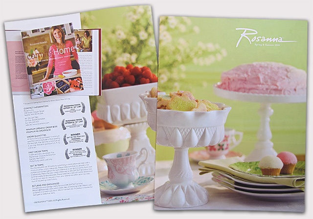
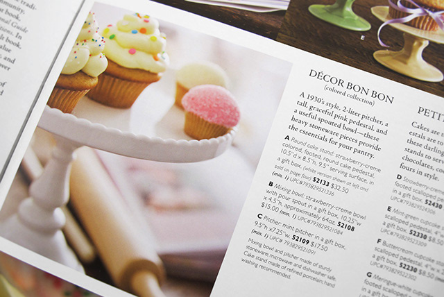
While at Rosanna, Inc. in 2009 I had the privilege of designing their Spring 2010 catalog. Working with a talented stylist and a talented photographer, I art directed the Spring 2010 line product photo shoot and did the subsequent photo editing and the catalog layout.
While working for Positive Action, Inc. in the early 2000's I completed their first real product catalog in years, from scratch, doing a lot of new product photography myself, working with the owner and a staff writer to develop copy and headlines, and implementing a brand style I helped create to standardize their hundreds of products and all their marketing materials. A few years later I brought their second catalog almost to fruition before I handed it off in order to move to Seattle.
While at Rosanna, Inc. in 2009 I had the privilege of designing their Spring 2010 catalog. Working with a talented stylist and a talented photographer, I art directed the Spring 2010 line product photo shoot and did the subsequent photo editing and the catalog layout.
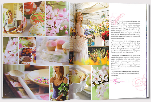
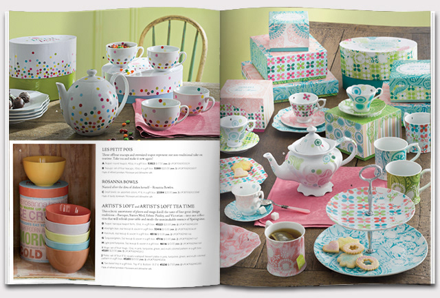
Lifestyle and flower shots in the above spread were taken prior to my involvement with the project, many from Rosanna's book, "Coming Home."
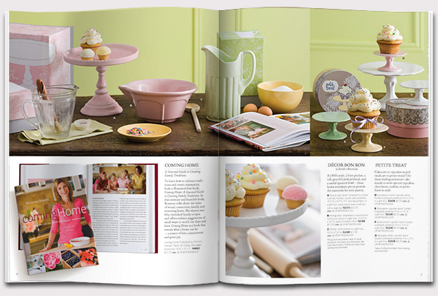
In the above spread, bottom left photo was from an old shoot.
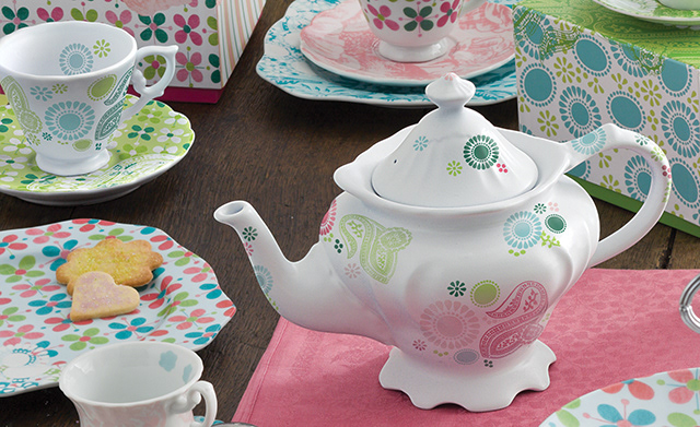
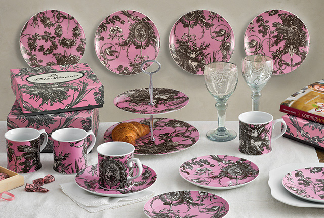
The teapot and one teacup we did not receive samples of in time for the shoot. We used the forms, which I painted for the shoot. I applied the artwork on the photograph digitally.
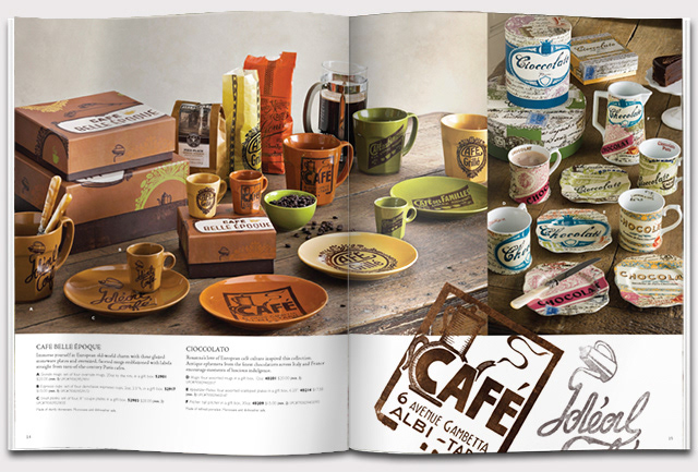
In the above spread, the photo on the right was from an old shoot, not the one I helped art direct.
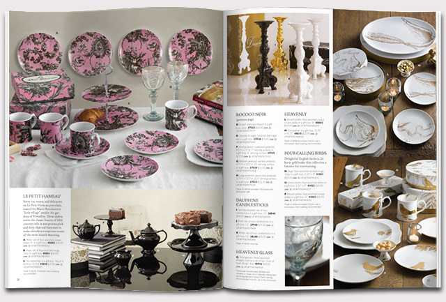
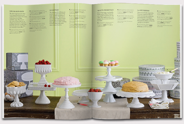
Note, In the above spread, only photo from the shoot I was involved in is top left.
In the actual Le Petit Hameau Collection shot (edited shown in catalog and below—I don't have the original photo files), there were no plates on the wall and the bottom tray in the two tier serving plate was blank (as we also did not receive that sample in time for the photo shoot). After the photo-shoot, I took photos of the plates in the office, trying to mimic where highlights would be, and placed them in the photograph, using Photoshop to add wall shadows and reflections in the glass.
In the actual Le Petit Hameau Collection shot (edited shown in catalog and below—I don't have the original photo files), there were no plates on the wall and the bottom tray in the two tier serving plate was blank (as we also did not receive that sample in time for the photo shoot). After the photo-shoot, I took photos of the plates in the office, trying to mimic where highlights would be, and placed them in the photograph, using Photoshop to add wall shadows and reflections in the glass.
Note, In the above spread, only photo from the shoot I was involved in is top left.
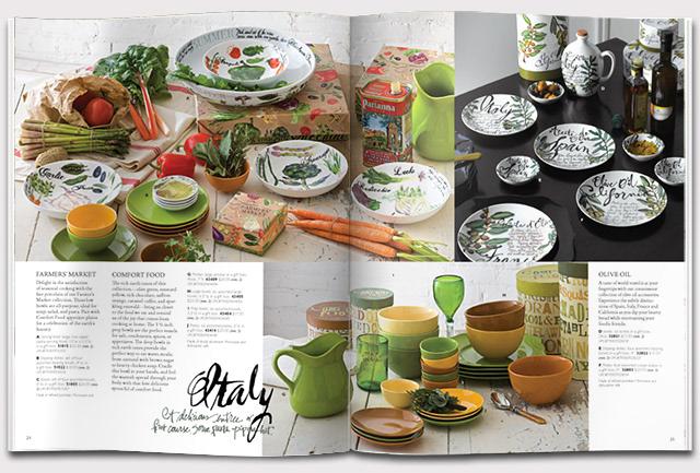
Note, In the above spread, top right photo was from a previous shoot.
Below, the two catalogs for I designed for Positive Action, Inc.
(The Hobo font had been used in the company for 20 years and would not be changed.)
(The Hobo font had been used in the company for 20 years and would not be changed.)