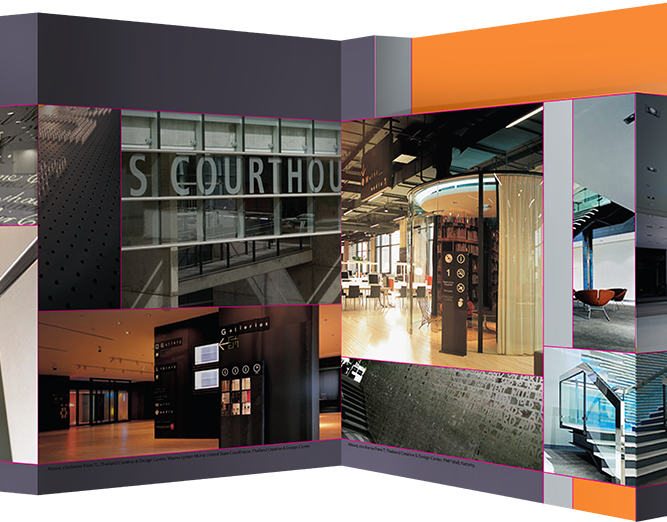
I spent much of my time in Azure utilizing very limited pixels for a huge variety of needs. It might sound technical and dry, but it was really satisfying to coordinate with so many different feature crews and service providers to develop dashboard tile patterns and guidelines that could best fulfill the needs of everyone, including accurately (and aesthetically) representing data and notifications to end users, all within the guidelines of the metro style of early Azure, at Microsoft 2012-15.
Microsoft Azure Portal content was surfaced to users primarily through pages called "blades" that opened horizontally (creating a natural breadcrumb). Content on blades could either be locked (such as form fields or tables) or content could bubble up on customizable and rearrangeable 'live' tiles (interactive tiles). Live tiles had eight (eight!) sizes that users could switch between to customize their dashboards, with content optimized for each size. The visual pattern and interaction guidance needed was extensive, to say the least.
I organized generic content categories for the tile types and spec'd layout rules and guidance for each category (via meeting with a myriad of users internal and external). I explored best case and worst case scenarios for each tile type to avoid blind spots. I created guidance documentation for distribution to other Azure designers and Azure's onboarding partner services, served as a point of contact for all questions about the portal tiles, and continued to adjust and coordinate with all involved as new content and needs emerged.
For instance, general intrinsic (intrinsic: supplied by Azure for partner use) tile types fall into three categories: single item, multi-item, and non-item. I created a visual tree of these types of content and their layouts at different sizes, which you can see a few images down.
Much of my later time on the Azure team was spent understanding onboarding service partner's scenarios to advise them on pattern use/correct implementation and to identify situations that needed new patterns. Often, partner's scenarios would lead to portal-wide pattern adjustments (as we learned how intrinsics were used in the wild) and I kept an eye on engineering changes to make sure updates wouldn't break other partner's tile use. This also included policing when an intrinsic could be adjusted and when a partner had a unique enough need that they would have to develop a custom solution themselves.
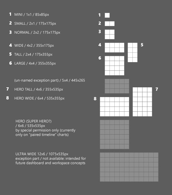
When I started at Microsoft my design team was just beginning the process of redesigning the Azure Portal. We landed on a 5-pixel based grid. We chose the above sizes for the tiles. "Unlocked blades" and the "Startboard" are made up of tiles. The user can customize the size of the tiles and rearrange the tiles. There's a progressive revelation of detail and information at each size, with many content types having interactivity on the tile, especially at the larger sizes.
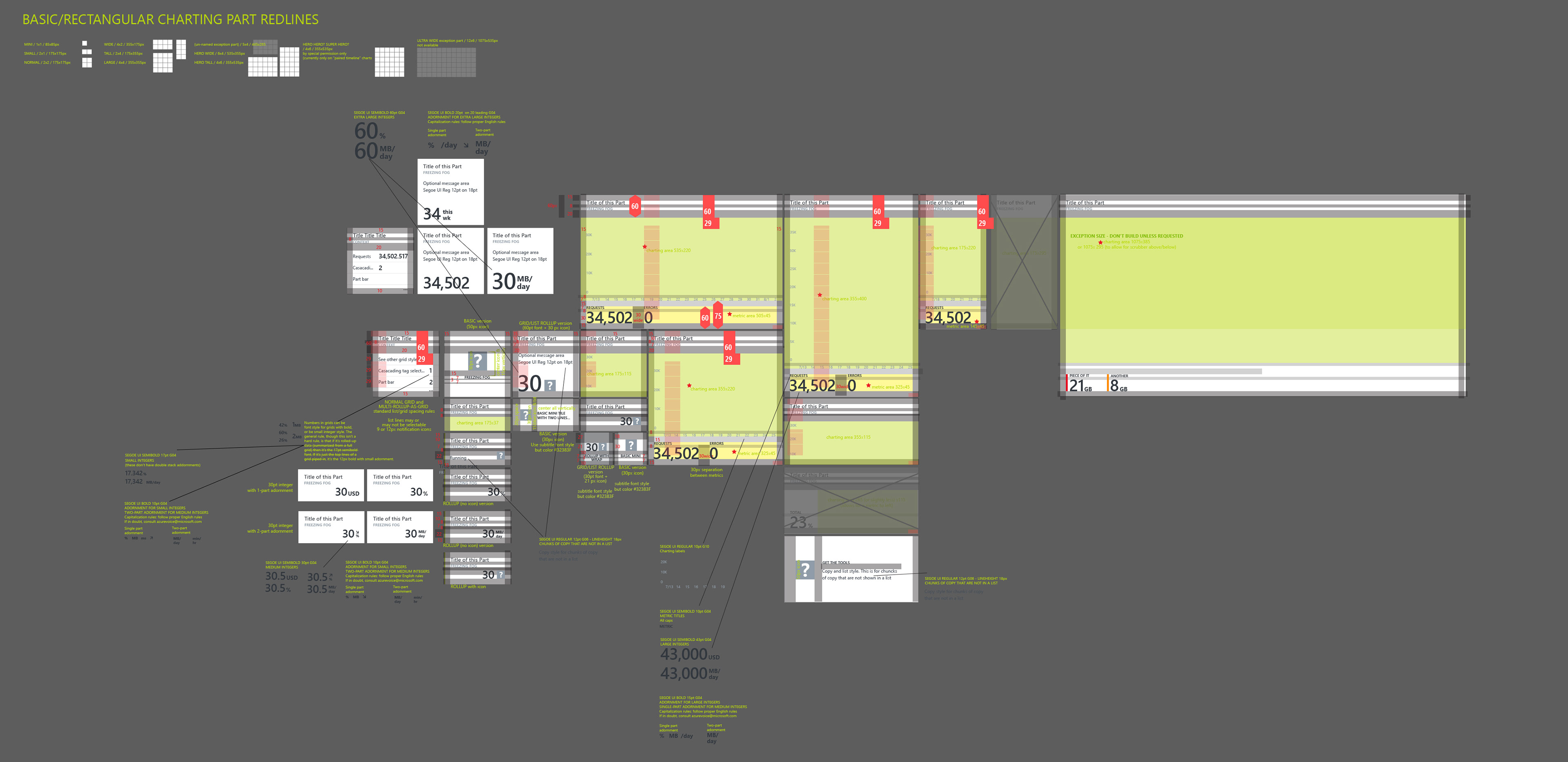
The above is just one Illustrator art-board from a massive file of resources for designers to help them follow patterns for the Azure Portal tiles.
Below, how I communicated a vast number of tile patterns to onboarding partners needing help, or even to my teammates when they were building new features. Dividing the tile types into non-thing / multi-thing / single thing allowed people to easily talk about what they needed and to see the possible progression of tile types for their needs.
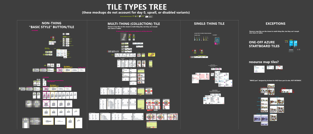
The patterns for tiles became progressively more complicated as more services were added and more partner products came onboard. I developed several ways of classifying tiles to help explain patterns and to help other designers. These are the main classifications to determine which design rules new tiles would follow:
1. "non-thing" such as tiles that functioned essentially as buttons and direct somewhere (like to a dev console) or day 0 setup instructions;
2. "multi-thing" which were lists, tables, data visualizations, rollups, etc.; and
3. "single thing" tiles which might represent the health of a single resource or surface properties of a single resource.

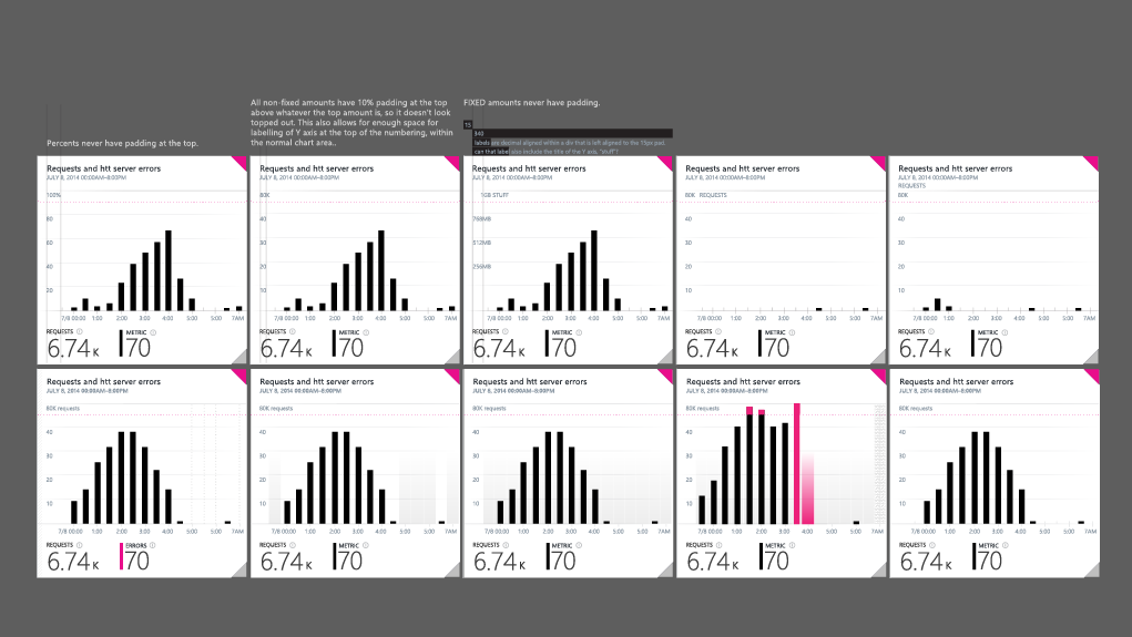
Mulit-thing/collection tiles were the most complicated. Just the options involved in displaying tables of data at various sizes became very complex and we had to make some difficult choices along the way about spacing, wrapping text, rollup numbers, labelling, sizing, notifications, etc.
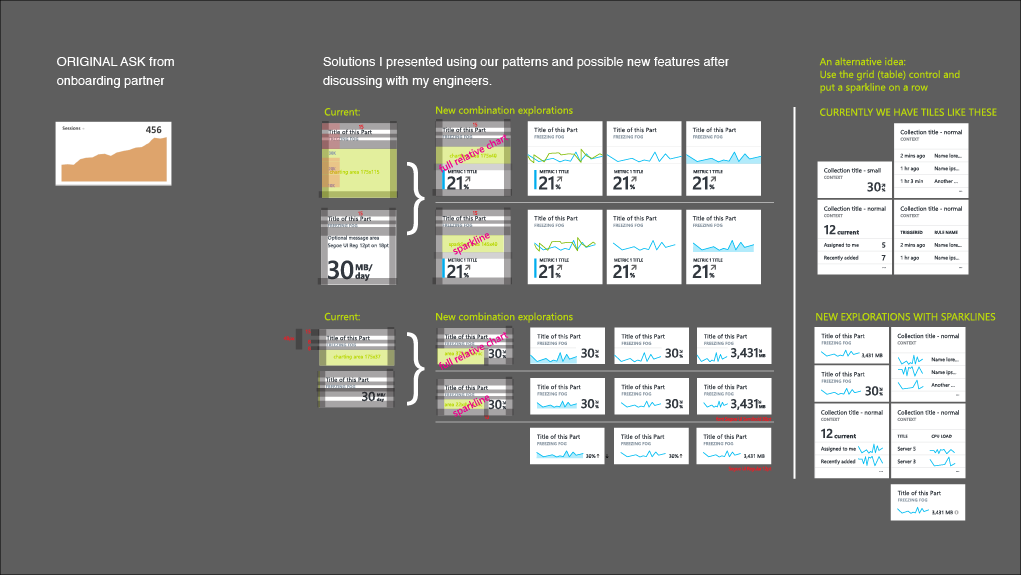
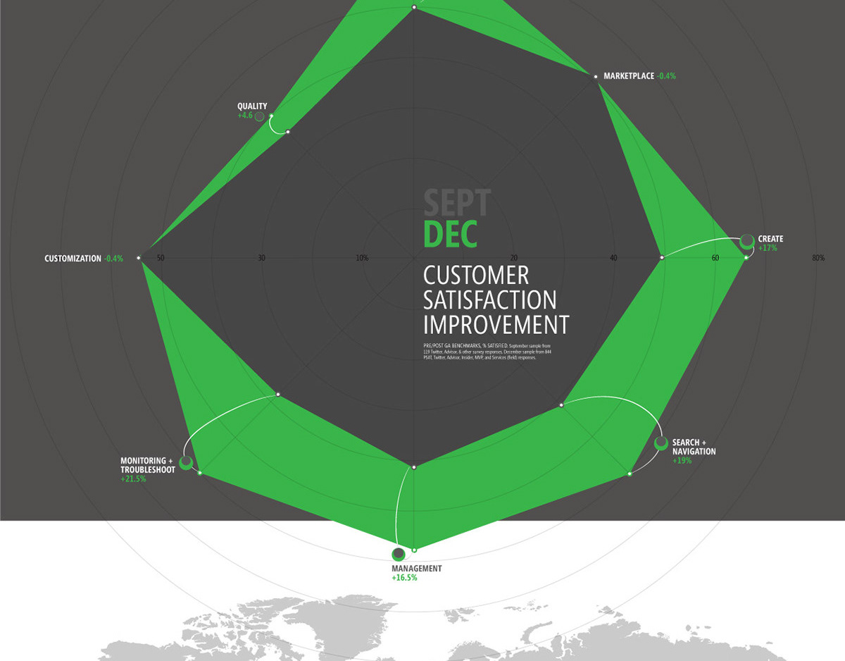
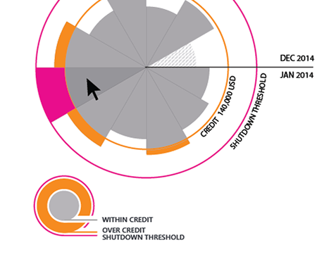
A lot of my daily work was with the people building Microsoft services in Azure Portal, converting existing services to the Azure Portal, or third-parties in the process of onboarding. For instance, I would get tile ideas like what you see below on the left from project managers and I would work with them to understand what their data was showing so we could appropriately represent it with the patterns established for Azure. Often this would uncover issues with how a service was already representing their data and it was wonderful helping them to rethink what their users were trying to get out of the service.
Sometimes the work was seeing problems with our patterns and being proactive about solutions. For instance, charts were often empty even though services were working properly. These are explorations for showing a user that data is being pulled, but the values are low or zero through subtle tic marks, highlights, etc.
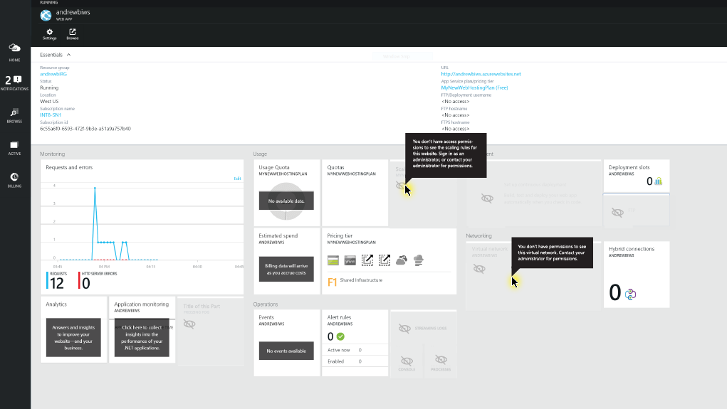
Below is a pattern fix for permissions. Permissions caused problems with end-user's shared dashboards (between two or more viewers) and partners (internal and external partners offering services through the Azure portal) were all using their own style to show that a user didn't have permissions to the data under a tile. Below is just one of my mockups to umbrella all the different permissions needs in one set of UI patterns.
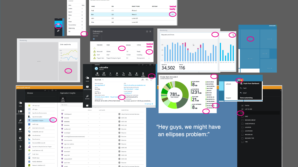
Below; even small things can cause issues: I called the team's attention to an overuse of ellipses in the product (below) and we put in place new rules and adjusted some UI to more appropriate affordances.